The end result of all of the work that goes into the planning and designing of a client's party is probably the biggest reason why I love what we do. My favorite events are personal events vs. corporate events, because the families are so personally invested and therefore we get to help create a beautiful and unforgettable day that they will remember for the rest of their lives. So much of the time I spend in preparation with my clients, is spent with them learning to trust me because until we can physically show them some of the designs they have paid for, they are going on pure faith that we are going to create something they love. So, the end result is amazing. The end result is definitely the best part. Two weeks ago, we had a double booked day: Two Mitzvahs- one a Bat Mitzvah for Lindsay, who was dreaming of a Hollywood Award themed Party space and one a B'nai Mitzvah for twins, Rachel and Adam, who despite very different likes and dislikes decided on a Vintage Soda Pop theme for their party!
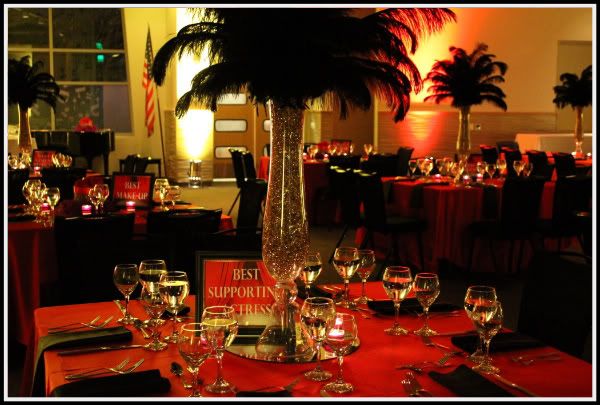
I headed up the Award party, while Karen got the Vintage Soda Pop party underway. Lindsay's party was at the beautifully re-designed Temple Judea in Tarzana. I had worked at this Temple many times prior to the re-model and was excited to get to work in the new space, which was purposefully designed as a blank slate, so that each party could take on an identity all it's own. Our Hollywood Award theme was done on a modest budget, and even though the design is simple in it's execution, I think the result is fairly dramatic!
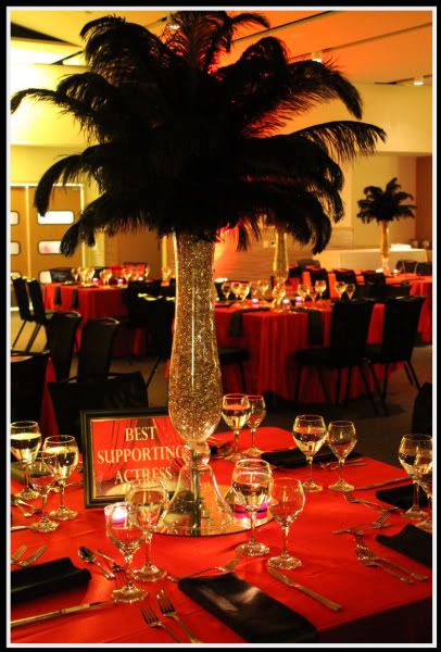

We combined two different styles of centerpieces- a tall and a low centerpiece option, alternating throughout the room. This idea gave us the best use of the budget and created a nice sense of dimension in the room. Each table was named after the awards you might see at the Oscars or The Emmys: Best Director, Best Supporting Actress, Best Costume design, etc.
The red and amber lighting really warmed up the space and the sateen linens added an element of luxury to the whole room! Although our main colors were red, black and gold, Lindsay's favorite color is purple, so we found small and subtle ways to include a pop of purple color into the overall design. I jump at any chance I can to add personality to a design by finding personal and sentimental touches wherever possible!
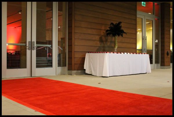
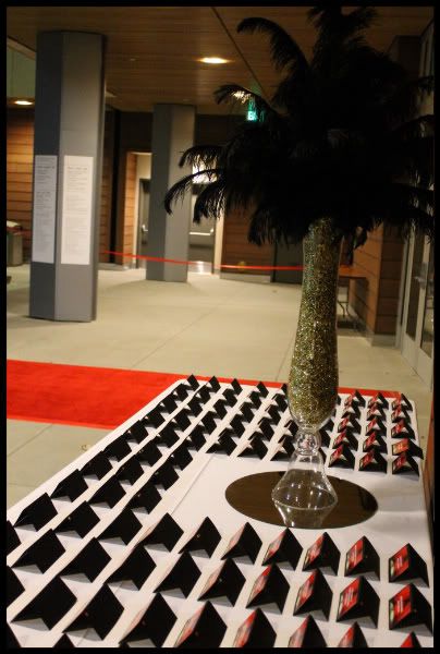
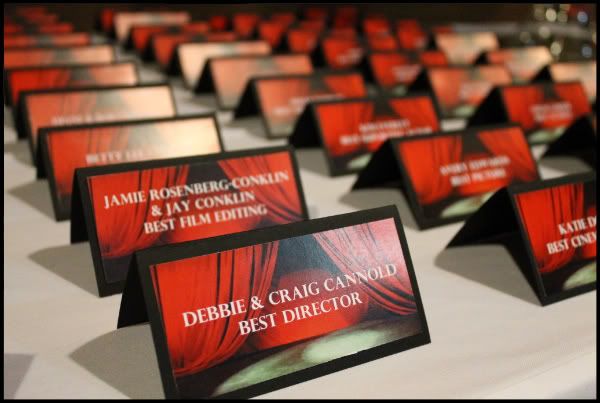
We welcomed the guests on a red carpet and they picked up their name cards on the way in. We designed the style of the name card to coordinate with the table name signs, and though the effect was simple, it was beautiful.
Lindsay's family spent the rest of the weekend and early part of the next week just soaking up all of the memories and relaxing after a wonderful and meaningful day. I received a follow up email from Lindsay's Mom:
Dear Jennifer,
We thought the whole evening was absolutely wonderful! Lindsay said it was the best night of her life. It was very special for all of us. It was a pleasure working with you during the planning, and also the evening of the party. We had a few bumps in the road, but they really didn't seem to matter, especially since you were there to handle them!
Thanks so much!
It was an absolute pleasure to work with Lindsay and her family also, who were easy going and trusting throughout the process. I couldn't be happier to have had a small part to play in Lindsay's happy memories!!
While I was busy at Temple Judea, Karen was across town with our crew, busy transforming Shomrei Torah into a Vintage Soda Pop haven. Rachel and Adam wanted to use their favorite colors, pink and blue, in a way that wouldn't turn the whole place into a giant baby shower. So, we thought...why not the hot pink and electric blue that you would find on old neon soda shop sign! Our graphic designer, Sarah, came up with these adorable vintage inspired designs that named each table after a classic, or favorite, soda pop. Dad's Rootbeer, Coca Cola, 7up, Nesbitt Strawberry and A& W Rootbeer name just a few...
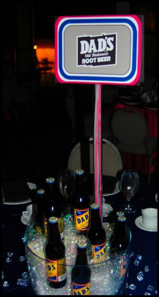
The centerpieces were very budget friendly as oversized "ice buckets" filled with glass bottled sodas, iridescent shred and acrylic ice cubes.

Our acrylic table name stands contained pink and blue neon necklaces to give just a little extra pop of color. Everyone seemed to think it was a clever way to bring in the idea of neon lighting...
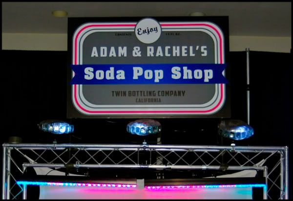
The little details in our party sign, really got Rachel and Adam excited-"Twin Bottling Company" and "13 fl. oz." (since they are both 13) seemed fitting and fun!
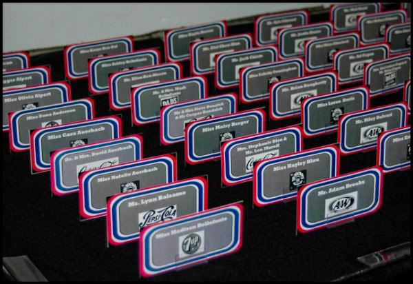
The name cards coordinated with the table names and party sign and were the guests first glance at the overall theme while they enjoyed some drinks and snacks prior to the start of the main party. We could barely get a picture because the guests were so interested and excited by these cards and were quick to grab theirs and go!
The aftermath of a special event is usually quite sweet, and we enjoy it almost as much as our clients do. We will always work to exceed expectations because the feeling of pleasing our clients is extremely important to us!
Stay tuned- we have more adorable events on the horizon! Next up? Another double day: A beautiful, girls-only birthday party and a Martha's Vineyard inspired Bar Mitzvah...


No comments:
Post a Comment